Microsoft Edge:
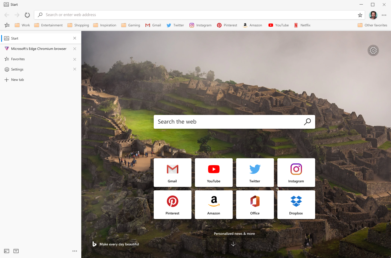
Vertical Tabs
New browser feature
Microsoft circa 2019
- Senior UX Designer
- User Experience
- User Interface
- Visual Design
The Microsoft Edge team wanted to solve the pain point of managing tabs in a limited space—to also potentially create a competitive differentiator from Google Chrome. We wanted this feature to be part of a larger tabs system as an alternate view to make tabs potentially easier to scan and manage.
I worked closely with product management to refine this feature through user testing and internal socialization of the concept within the Microsoft Edge product team.
Objective
The goal of the design was to make it easier to manage an extreme amount of tabs. Horizontal tabs become less useful as more of the title became obfuscated by lack of space as more tabs are added.
The hypothesis was that a majority of people had an extreme amount of tabs open and some issues managing anything above two dozen.
The Default
The default being the tried and true horizontal tabs.
Going Vertical
We were already likely going to build this feature, but it needed some justification to commit resources
As we ran user interviews and studies, we learned that most users don't tend to have as many tabs open as originally hypothesized—generally hovering around five tabs with top reasons being cognitive load, title real estate, and computer speed.
Almost all participants said they could see it being useful and may change their habits if it benefited their existing workflow.
Compact Mode
An alternate UI mode that increases viewport real estate and minimizes visual clutter.
Hover Behavior in Compact Mode
A "quick view" is displayed when the cursor hovers over the the tabs UI. This mitigates the need to toggle UI states to view tab titles or interact with its controls.
Patented???
This was sort of a surprise to me that this design could be patented, but I thought it was cool that it did happen.
US11531719B2: Navigation tab control organization and management for web browsers


